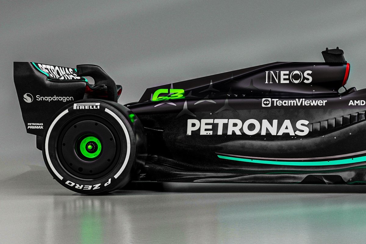
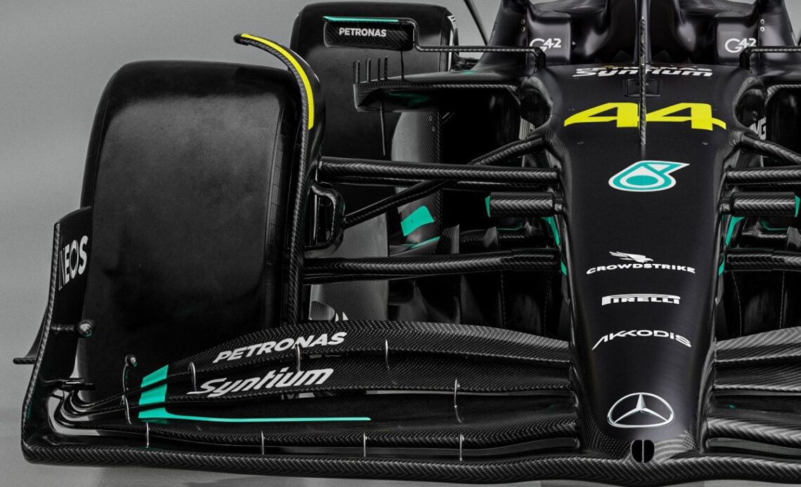
Mercedes made a bold statement about its quest for improvement by revealing its black and raw carbon fibre skin on the new W14 Formula 1 car on Wednesday.
While that move triggered a lot of interest, there were actually a lot of other detailed areas of the car that deserve as much attention.
The W14 itself hasn’t been completely overhauled, as some might have expected given the trials and tribulations that its predecessor posed for the team during 2022.
However, there’s all-round refinements to be noted, including the zeropod solution. This remains for now, but in a different form, as it has been re-engineered to improve the airflow’s passage to the rear of the car.
Mercedes W14 detail
Photo by: Mercedes AMG
The infamous upper SIS cowling is still there and broadly indicates how much narrower the rest of its sidepod is compared with the rest of the grid when viewed from the front.
Atop we find a similar arrangement to last season in terms of the fins and mirrors, albeit with the latter complying with the new width requirements.
At the front of the sidepod, the inlet is now vertical, rather than tapering down and out toward the floor’s edge. The flank of the sidepod is also wider than in 2022, as it too takes on more of a conventional shape in order to improve flow to the rear of the car.
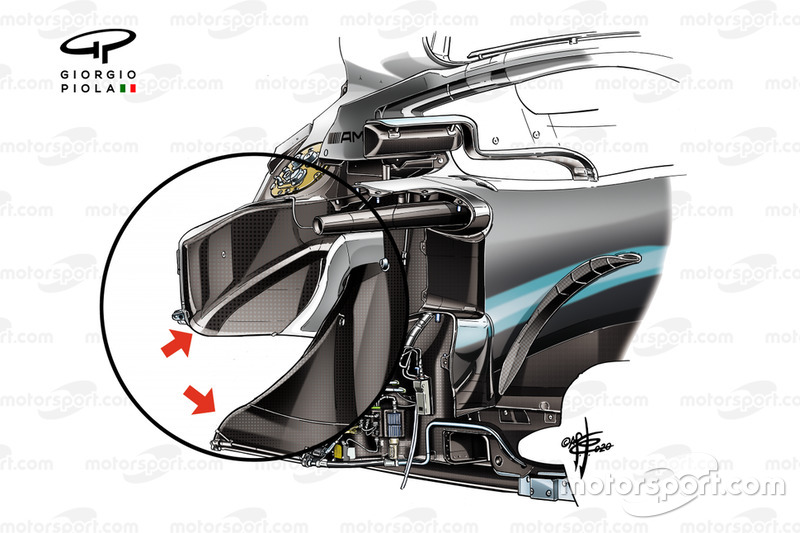
It’s clear that these changes have required an immense amount of work to repackage the internal components, with the team continuing to find ways to bury the radiators deeper into the chassis than it has before.

Mercedes AMG F1 W10, chassis
Photo by: Giorgio Piola
And, whilst this is a design feature that most of the grid have now appropriated to one extent or another, being the first to do so has always given Mercedes a head start on the rest, allowing it to find ways to be one step ahead of its rivals.
The high-waisted engine cover shelf that emerged from the halo section of the W13 has also been retained. However, akin with what its competitors did in 2022, it now extends all the way down to the rear of the car and terminates in a wider rear cooling outlet.
The shelf also has a chute-like geometry, rather than being completely flat, in order that the various flow structures don’t overlap as they compete for space.

Mercedes W14 detail
Photo by: Mercedes AMG
And, again, like rival designs, the cooling outlet is hoisted as high as possible, not only clearing a passage beneath for the suspension elements but also improving flow…
Click Here to Read the Full Original Article at Motorsport.com – Formula 1 – Stories…

