But with the countdown now well underway to the unveiling of the 2024 cars, it is a good moment to reflect on that moment 10 years ago when F1’s regulations opened the door for perhaps the ugliest cars we had ever seen.
It was the start of the much vaunted ‘hybrid’ engine era, where the introduction of the sport’s most technologically advanced powertrain should have been the focal points.
Instead, we found ourselves questioning why F1’s cars all looked so weird thanks to their horrendous noses.
Photo by: Patrik Lundin / Motorsport Images
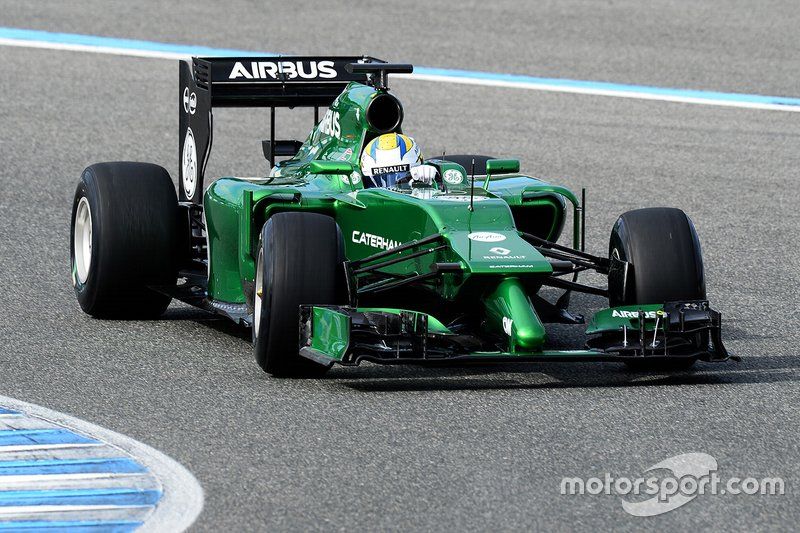
Marcus Ericsson, Caterham F1
A regulatory misstep
The design trend had occurred due to a sizeable shift in the regulations, as the FIA had attempted to overcome a design feature that had become prevalent during the former rules era.
This had been of designers lifting the nose tip as high as possible to improve the airflow’s behaviour downstream. This had triggered another aesthetic nightmare, when the step nose blighted 2012’s machines.
It was something the governing body had hoped wouldn’t be repeated…
But as the FIA moved to stamp out that problem, it created another – as McLaren, Force India, Sauber, Toro Rosso, Williams and Caterham all presented nose solutions with a narrow, elongated tip section that looked quite ridiculous – but clearly had some performance advantages.

Photo by: Giorgio Piola
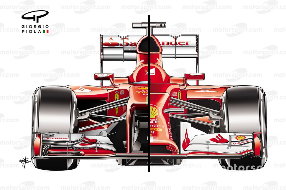
Ferrari F14 T front view comparison with F138
This side-by-side view of the previous year’s Ferrari F138 and 2014’s F14T illustrates how much of a difference the proposals were designed to have, not only to the profile of the nose but also how that would influence other aspects of each car’s design.
The FIA sought to lower the nose tip on the grounds of safety and attempted to enforce a lower nose tip section within the regulations.
The rules required the lower edge of the tip to be no higher than 185mm from the reference plane and project no more than 250mm above it, while at a point 50mm rearward of the tip further volume constraints were added.
The seven teams who all went down the ugly nose route had seen these dimensional requirements and quickly realised that they could mitigate some of the associated losses by creating a slender nose tip section, which would provide a more desirable passage beside it for the airflow.
The only challenge now posed was being able to pass the crash test with a structure that was essentially much shorter, given that…
Click Here to Read the Full Original Article at Motorsport.com – Formula 1 – Stories…

