Formula 1 was strikingly different 20 years ago: bellowing normally aspirated V10 engines instead of V6 turbo hybrids, cars largely bedecked in tobacco advertising and a completely different roster of drivers – besides Fernando Alonso, of course.
Online life was unfamiliar too. The internet had not yet become the all-encompassing beast of today. YouTube and Twitter (never mind ‘X’) lay in the future, and Facebook was still called TheFacebook.
But all 10 teams had long realised it was the place to be. Even Bernie Ecclestone’s Formula One Management had belatedly agreed and got in on the action, having acquired rights to the Formula1.com domain two years earlier.
In a world transitioning from slow dial-up to high-speed broadband connections, and the mobile internet revolution still a way off, F1 websites were much more modest affairs than now. The Internet Archive’s Wayback Machine allows us to turn back the clocks and look back at how Formula 1 websites were, before the age of Web 2.0 and responsive browsing, to when Flash ruled the day.
Advert | Become a RaceFans supporter and
Teams
Ferrari
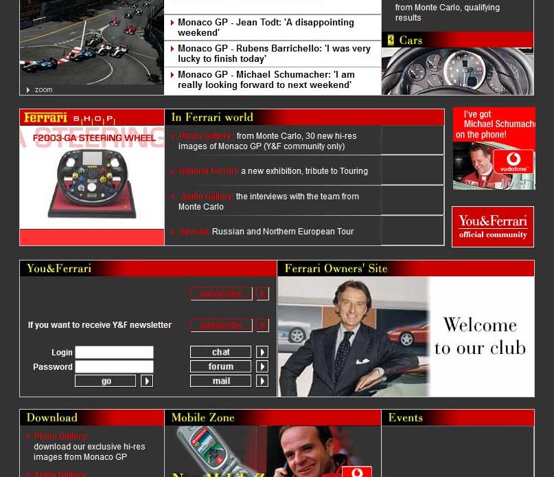
As the reigning champions in the midst of their domination over the sport, Ferrari’s website was unsurprisingly one of the most comprehensive available, and plastered with promotions for their telecommunications sponsor featuring six-times-champion-going-on-seven Michael Schumacher.
McLaren
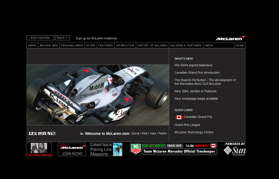
As one of the most popular teams in the early noughties, it is little surprise that McLaren had one of the sleekest presences on the web.
Advert | Become a RaceFans supporter and
Jordan
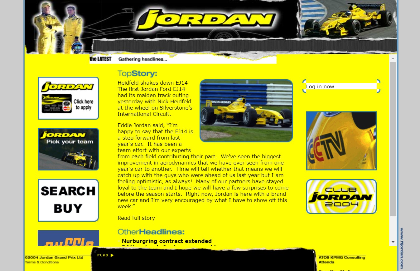
Much-loved extrovert outfit Jordan increasingly looked like a spent force by 2004. Founder Eddie Jordan was soon to sell up (note the optimistic quote above), beginning a long line of name changes which would end with them becoming Aston Martin.
But their website was exactly what you’d expect from his team with a healthy dose of their trademark bright yellow.
Minardi
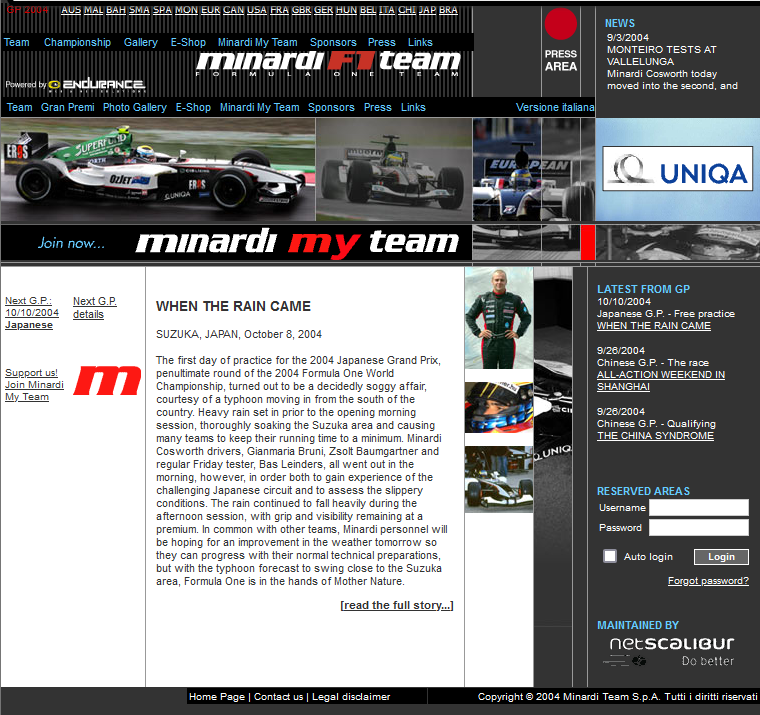
As ‘everyone’s second favourite F1 team’, Minardi had plenty of fans as the biggest underdogs on the grid. The beloved minnows put fan engagement at the heart of their website, with a fan membership function.
Rather like the logos on their car, the brief for the layout appeared to be ‘cram as much in as possible’. Sadly, like Jordan, the Minardi name disappeared at the end of the following season.
Sauber
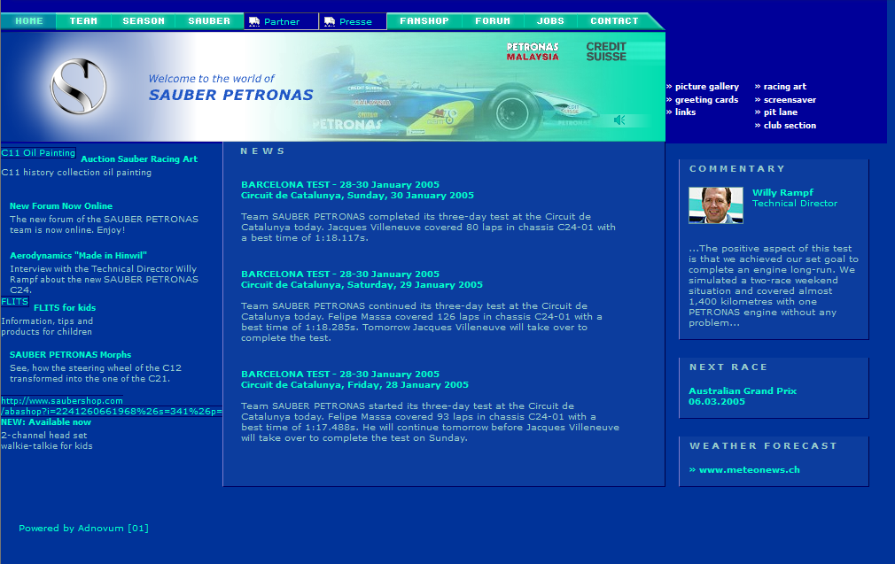
In the bold blue colours of title sponsor Petronas, the Sauber website was surprisingly loaded with…
Click Here to Read the Full Original Article at RaceFans…

