Nothing about last weekend’s NASCAR Cup race at Phoenix Raceway got my engine revving, for better or worse.
It was the definition of what the kids call “mid” these days.
But at least the race saw a 19% increase in its TV rating from last year. Whether you want to credit Netflix, Chase Elliott‘s presence in the field, the Iowa women’s basketball game that preceded it or whoever the person is behind the IcyVert Twitter account, 700,000 more viewers is nothing to sneeze at.
So, this week I’m gonna talk about something very important in the world of NASCAR: paint schemes.
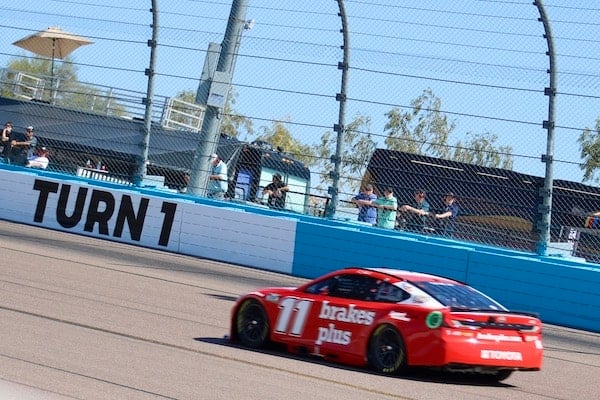
It was brought to my attention over the weekend that some people in the NASCAR ether apparently didn’t like Denny Hamlin‘s Brakes Plus paint scheme.
Which absolutely made no sense to me.
This scheme rocks.
Why does this apple red car appeal to my visual senses?
Because it pops without overwhelming them.
This is the kind of scheme that, if used long enough, would be instantly recognizable in a wide shot on TV (at least not when a network like FOX uses a helicopter shot pulled back so far for multiple laps you can’t tell the difference between anyone).
Bright red car? That’s Hamlin.
Long gone are the days when a team used one paint scheme for all 30+ races in a season.
Show a NASCAR fan old enough a wide shot of the field running through the tri-oval at Talladega Superspeedway back in the day, and they can likely name off most of the drivers in an instant.
Why did so many fans of a certain age gravitate toward Jeff Gordon in the 1990s?
Because of his instantly recognizable rainbow DuPont scheme.
20 years ago, simple was iconic.
Now? Iconic is whatever happens to be on the track most often.
Arguably, the last paint scheme that was instantly recognizable from a bird’s eye view was any of Danica Patrick‘s GoDaddy.com cars.
Bright green car? There goes Danica.
The mid-2000s brought about an economic downturn and the decline and disappearance of season-long sponsorships.
Then came one of the worst things to ever happen to NASCAR: wraps.
Instead of the time-consuming effort of painting a car, now teams could just design a scheme in a computer program and then print it off.
This has led to some … very busy-looking cars.
Schemes that make you want to tell the sponsors and teams “you were so preoccupied with whether or not you could, you didn’t stop to think if you should.”
There…
Click Here to Read the Full Original Article at …

