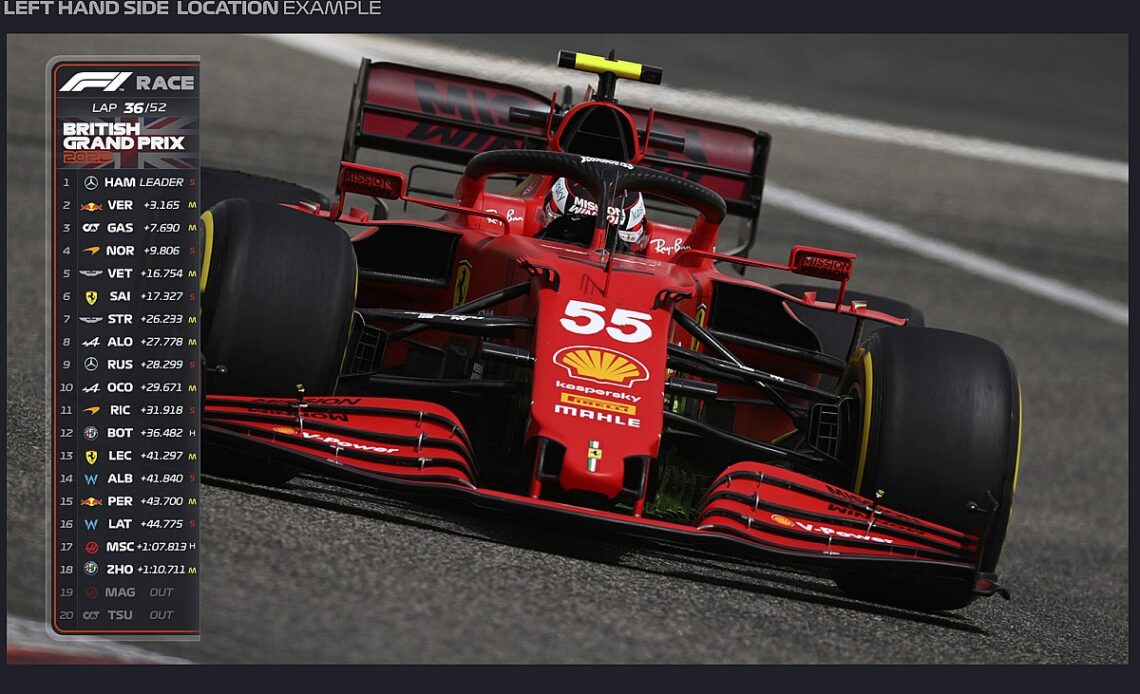
With grand prix racing starting a new rules era as the series switches to ground effect cars, F1 has used the opportunity to overhaul the graphics package that is shown on the international feed.
Being given much more prominence and space on screen than before, the focus is a strip that runs down the left hand side of the screen and is situated below the F1 logo – which has been moved to the top left of the screen
Dean Locke, F1’s director of broadcast and media, told Autosport: “We’re a graphic led sport, so with the new car, we felt it was a good time to rebrand our graphics as well.
“We’re probably a year early in our normal cycle. But we thought we would do it in line with the new regs and new car.
“They are new look and they are very different to what we’ve had before from a look and feel concept. They are bold, they’re a bit fresher, a bit younger. They take a lot of influence from digital and film.”
As well as the different look, the new graphics give F1 better…
Click Here to Read the Full Original Article at Autosport.com – Formula 1 – Stories…

