The more restrictive regulations in terms of design freedom prompted fears that the only variation we would see among cars would be with the sidepods.
However, as the F1 season has developed, there has been a fascinating mix of ideas and solutions up and down the grid that are worth focusing on.
Here we take a look at some of the key areas where teams have allowed their own concepts to flourish with some stand-out designs.
Noses
F1’s new regulations were not only crafted to try to promote closer racing, but also as a means to prevent the car looking ugly.
One such area that’s been afflicted by abhorrent aesthetics during recent regulatory eras has been in the design of the nose, as teams took drastic measures to try and out-think the constraints imposed upon them.
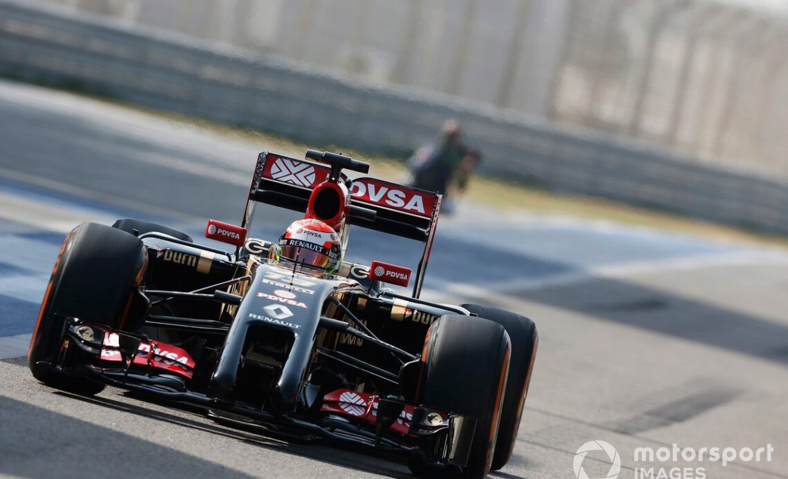
Attempting to find ways to drive more airflow under the car’s centreline led to some creative interpretations in recent years, with everything from the step nose designs of the 2012 season, to the twin tusk approach taken by Lotus in 2014.
Pastor Maldonado, Lotus E22
Photo by: Andrew Ferraro / Motorsport Images
The new regulations have been formulated in a way in which aesthetically displeasing nose shapes seem to be a thing of the past, albeit there’s still time for teams to upset that particular apple-cart.
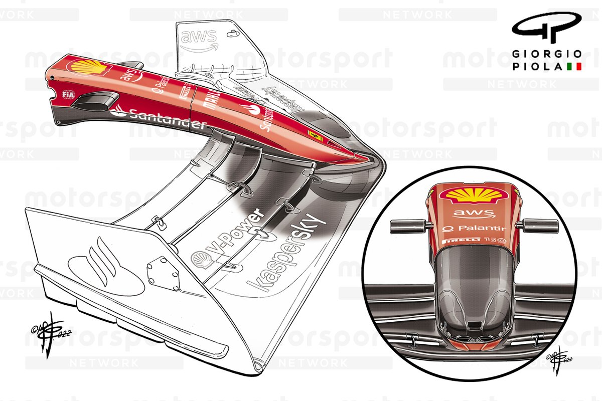
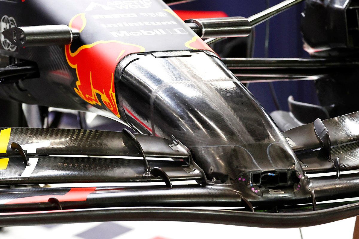
In terms of the current nose design, it comes down to how the team wants it to interact with the front wing and more specifically than that, whether the nose connects with the mainplane or the secondary flap.
In this respect several teams have opted for designs that are modular; affording them the flexibility to make changes should they be able to find more performance in another solution, without the need for wholesale changes and the need to pass new crash tests.
For example, as seen here with Ferrari and Red Bull, the inner structure of their noses is shorter than the outer facade, meaning that while they currently connect to the mainplane, they could easily be altered.


The bib wing
Another solution that has quickly gained traction up and down the grid, having been spotted first on the Aston Martin AMR22 at its launch, is the ‘bib wing’.
Referred to as much by several of the teams, it was swiftly adopted by Ferrari, who had a version undergo the rigours of simulation and production within the week between the launch of the AMR22 and its own F1-75.
And, while other teams weren’t as quick to respond as Ferrari, a variation of the design can also be…
Click Here to Read the Full Original Article at Autosport.com – Formula 1 – Stories…

